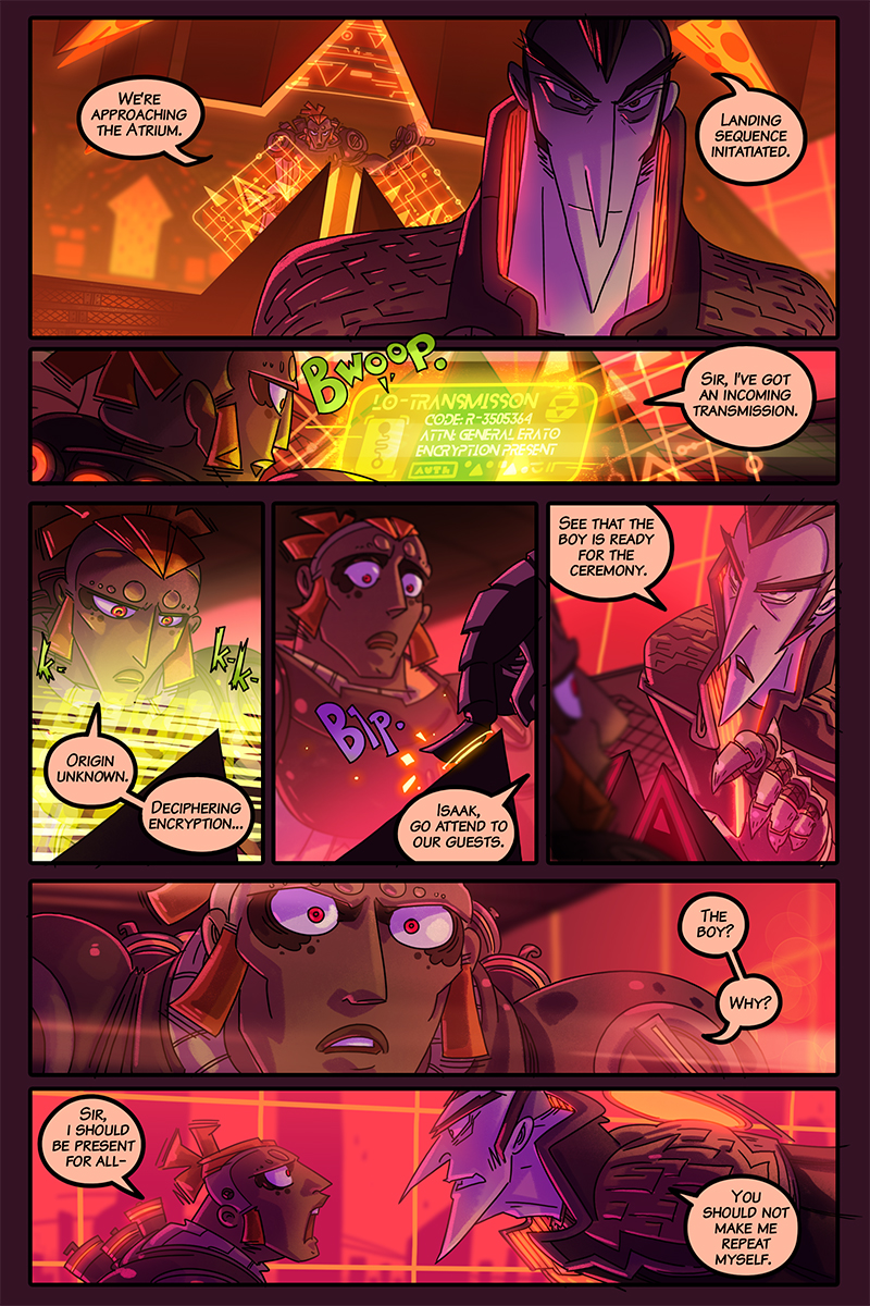
So many sharp angles.
Erato should have been a poster boy for a protractor company. XD
He seem… massive… in the first panel. I have to say it’s the first time I notice. I think the pointiness of the design made me think he was much skinnier.
He should start a pointy shirt business, and boast that his shirts make people look skinnier. Jun would buy one. :P
Not sure if I’ve totally resolved the sharp vs. imposing frame thing, but he definitely should be a huge presence in the room OwO
You know, it’s amazing how you switch color schemes every time you switch perspectives or scenes. It makes it a lot more easy to tell what’s going on, and I never would’ve thought of that (don’t know if it was intentional but good job!)
Yes!! I’m glad to hear it helps :D it also helps me make the dark/light pages not feel out of place in the layout, and they are fun to make x)

4 Comments
So many sharp angles.
Erato should have been a poster boy for a protractor company. XD
He seem… massive… in the first panel. I have to say it’s the first time I notice. I think the pointiness of the design made me think he was much skinnier.
He should start a pointy shirt business, and boast that his shirts make people look skinnier. Jun would buy one. :P
It’s true! Actually when we first saw him without his cape, he’s actually surprisingly beefy: https://www.levelthecomic.com/comics/01-01-07/
Not sure if I’ve totally resolved the sharp vs. imposing frame thing, but he definitely should be a huge presence in the room OwO
You know, it’s amazing how you switch color schemes every time you switch perspectives or scenes. It makes it a lot more easy to tell what’s going on, and I never would’ve thought of that (don’t know if it was intentional but good job!)
Yes!! I’m glad to hear it helps :D it also helps me make the dark/light pages not feel out of place in the layout, and they are fun to make x)